







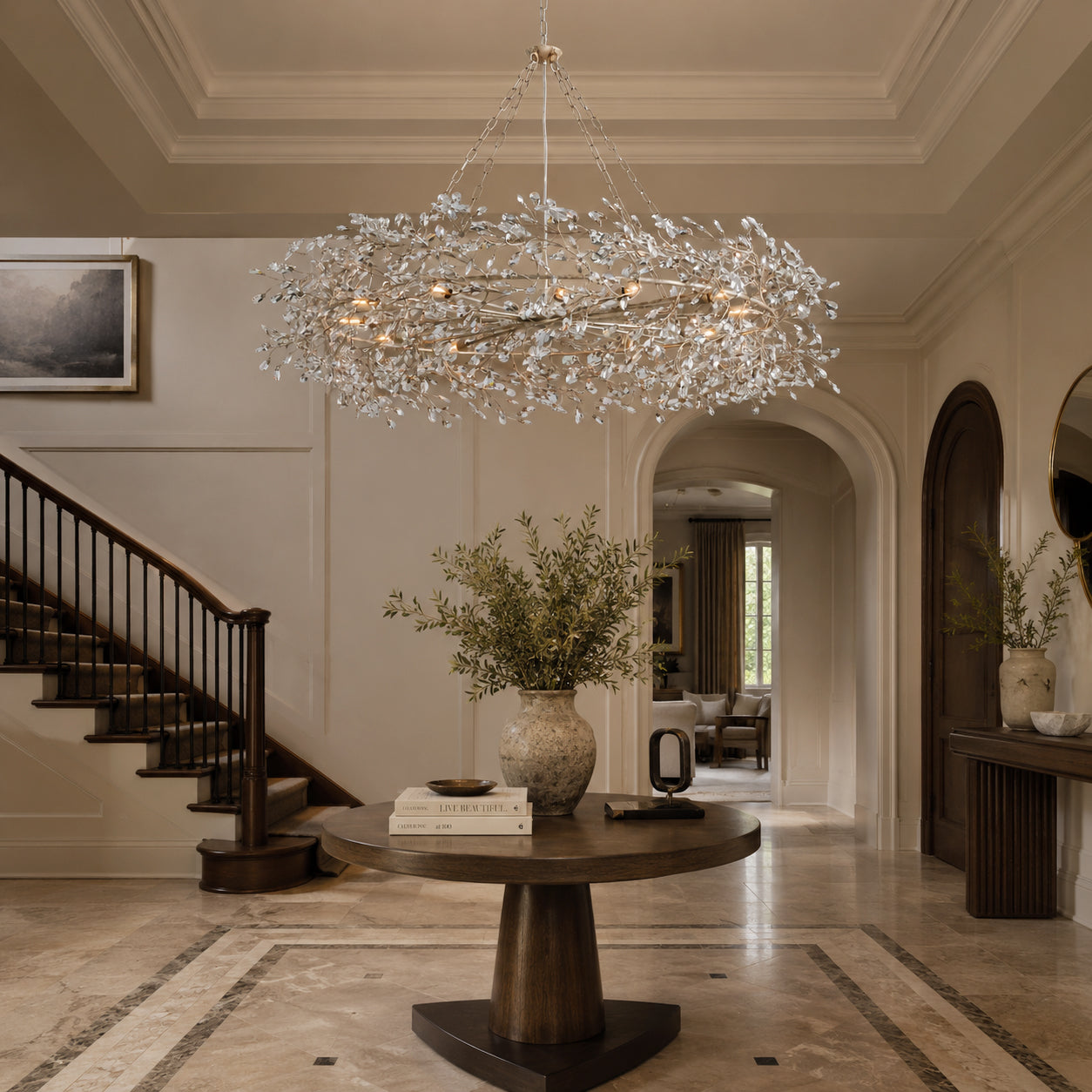

Alabaster vs. Glass vs. Crystal Chandeliers: How to Choose
11 minutes
Alabaster vs. Glass vs. Crystal Chandeliers: How to Choose
Carra Home Lighting Guide
The quiet depth of stone. The movement of glass. The glint of crystal. Choose the material that brings your room into focus.
The quick answer
Choose an alabaster chandelier for a substantial stone presence and softly luminous shades; glass for transparency, color, or flowing texture; and faceted crystal for crisp highlights and a more sparkling focal point. Then compare the actual fixtures: silhouette, finish, bulb visibility, dimensions, and care can matter as much as the material name. No category is automatically brighter, easier to maintain, or better made.

A chandelier becomes part of the room long before the lights are switched on. Its outline sits against the window, its finish repeats a detail in the furniture, and its surface catches the changing daylight. After dusk, those same choices shape a different atmosphere.
Begin with the quality you want to add: calm, openness, texture, or sparkle. The material is a useful starting point. The complete design is what you will live with.
Alabaster, glass, and crystal at a glance
These are shopping categories with some overlap. In decorative lighting, “crystal” may describe crystal glass; it does not, by itself, establish natural rock crystal, a particular composition, or a quality grade. Textured glass can also sparkle. Read the material description alongside the product name.
| Material | Visual character | Choose it when… | Look closely at… |
|---|---|---|---|
| Natural alabaster | Pale stone, veining, and a luminous surface when backlit | You want natural texture and a composed focal point | Stone variation, shade coverage, and overall visual weight |
| Glass | Clear, colored, frosted, or textured surfaces; effects vary widely | You want transparency or a particular kind of texture | Glass finish, layer density, and visible bulbs |
| Faceted crystal | Defined edges and small, changing highlights | You want sparkle and a more animated centerpiece | Facet shape, frame contrast, and the number of individual pieces |
Use this as a design guide, not a ranking of light output. A dense glass chandelier may feel more substantial than a spare alabaster design. A simple crystal fixture may suit a quieter room than a large, layered glass chandelier.
When to choose alabaster: quiet texture and presence
Alabaster is especially appealing when you want the light fixture to feel connected to the room’s natural materials. Beside oak, walnut, linen, or plaster, a pale stone shade adds another tactile surface without introducing a strong new color.
In a covered shade, the illuminated stone becomes part of what you see. The impression is different from looking through clear hanging elements toward individual bulbs. How much of the source remains visible still depends on the openings and your viewing angle.

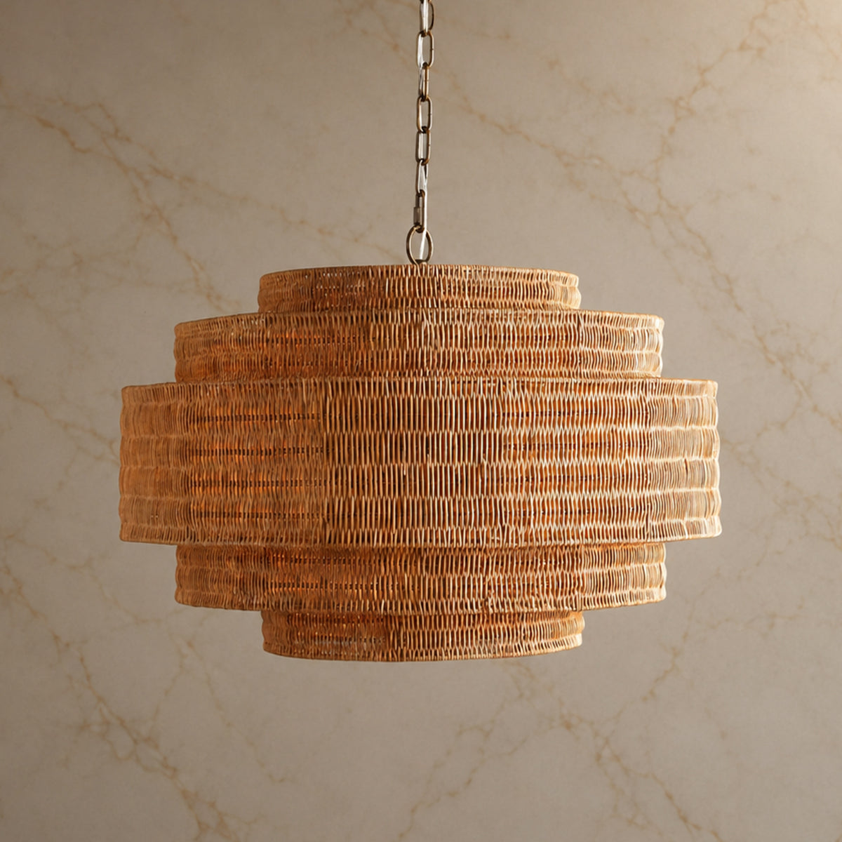
Lunareth illustrates this direction with a natural alabaster drum and a gold finish. Its broad, relatively shallow profile makes the stone the main visual event. Consider this approach when the table, artwork, and joinery already provide plenty of detail.

Natural veining is part of the choice. If you prefer an exceptionally uniform surface, ask to see representative stone details before deciding. Our alabaster chandelier buyer’s guide takes a closer look at the material and its appearance with the light on and off.
When to choose glass: openness, texture, and movement
Glass offers a wide range of moods. A few clear shades can leave a view feeling open; dense tiers can become a sculptural centerpiece. Frosting, tint, texture, and the space between pieces all change the result.
For a room with generous daylight, look at the fixture unlit as well as illuminated. Notice whether the edges nearly disappear against the window or create a distinct outline. A darker tint or a heavily layered form can have considerable presence even before evening.

Chiara pairs individually suspended glass elements with a gold finish and a tiered silhouette. It is a useful example of glass chosen for dimensional texture. It offers a more intricate outline than a stone drum, while the clear elements let you see into the form.
If a gentle-looking shade is your priority, inspect bulb visibility from a seated position. Clear glass does not automatically soften a direct view of the light source. Bulb choice and compatible dimming deserve attention alongside the glass itself.
When to choose crystal: crisp detail and evening sparkle
Faceted crystal is a natural direction when you want small highlights to become part of the composition. The effect can feel celebratory over a dining table, particularly when the surrounding finishes are restrained enough to let the fixture stand out.
The frame matters. A dark frame draws lines around the sparkling elements, while a lighter metallic finish can make the outline feel less pronounced. Neither choice requires a traditional room.

Vera combines crystal prisms with a black frame and stepped round tiers. The contrast gives the chandelier a graphic character that can connect with dark window frames or furniture details. Choose it when you want both sparkle and a clearly defined silhouette.

Sparkle is not the same as usable brightness. A photograph of bright highlights cannot tell you how evenly the table will be lit. Check the specified light source and plan the room’s other lighting before treating any decorative chandelier as its only source.
Choose for the room you have
For a calm room with layered natural materials
Start with alabaster if you want to continue the palette of stone, wood, and woven fabric. Keep the form simple when the room already has expressive grain or veining. If the space feels too heavy, also consider an open glass design: the visual balance may matter more than repeating the same material.
For a room that needs a focal point
Consider a tiered glass or crystal chandelier. Against a quiet wall, the outline can provide much of the interest. Choose glass when the shape and surface texture draw you in; choose a faceted crystal design when the contrast of edges and highlights is the detail you want to emphasize.

Ghiaccio brings texture and sparkle together through rounded, layered glass elements. Its product description calls the material crystal glass. Compare the flowing surfaces with Vera’s more linear, framed prisms: the shape of each element gives the two designs distinctly different characters.
For an open kitchen and dining space
Choose which fixture should lead. A detailed dining chandelier can work with simpler island pendants that repeat one finish or shape. The two areas do not need identical materials. Look across the entire room and ask whether the fixtures feel related without competing for attention.
For proportion and placement, use our dining room chandelier guide. Keep material selection and sizing connected: a design you love still needs enough room around it.
A closer comparison: four Carra designs
The round fixtures below offer a useful shortlist within an approximately 31.5–35.4-inch width range. Their depths and finishes differ. Use the widths below to compare scale, then check each design’s full dimensions and hanging range.
| Design | Listed material / finish | Selected width | Design distinction |
|---|---|---|---|
| Lunareth | Alabaster / gold | 31.5″ W | Broad stone drum; shallow profile |
| Chiara | Glass / gold; clear glass shown | 35.43″ W | Layered hanging glass; more vertical depth |
| Vera | Metal and crystal / black | 31.5″ W | Framed prisms and a stepped silhouette |
| Ghiaccio | Glass and metal / clear option | 35.4″ D | Rounded, textured tiers |
Start by choosing the outline you prefer, then the surface character. Before ordering, confirm the selected variant’s body height and total hanging range against your ceiling and furniture.
Care and the details to confirm before buying
Maintenance depends on construction as well as material. A chandelier with many hanging pieces presents more individual surfaces to clean than a simple shade, and a fixture above a staircase presents a different access problem from one over a dining table.
Ask for the care instructions for the exact finish and material. Do not assume a glass-cleaning routine is suitable for stone, or that a cleaner approved for one component is safe for the metalwork. With alabaster, confirm the recommended dry-dusting method before using any liquid. For any fixture, switch off power and allow it to cool before care, following the manufacturer’s instructions.
- Verify the material. Read the specification table and ask about any conflict with the title or description.
- Check the whole hanging height. Include the body, rod or chain, ceiling connection, and required clearance.
- Confirm the lighting details. Check bulb base, permitted wattage, whether bulbs are supplied, and dimmer compatibility. A material name answers none of these questions.
- Consider the daily view. Look at light-on and light-off images, plus the view from the table and doorway.
- Plan access. Ask how bulbs and individual shades or drops are reached, and how replacement parts are handled.
For the evening atmosphere, our dining room color temperature guide explains the next decision. Keep bulb color consistent when comparing fixtures; different bulbs can make the same material look quite different.
See your shortlist in your own room
A room photograph can make the choice more tangible. With Carra’s Design Preview Service, share your space and the designs you are considering. Compare the silhouette against your furniture, the finish against your existing details, and the visual weight above the table. A preview helps with composition; confirm dimensions, light output, and installation separately.
Frequently asked questions
Is alabaster better than glass for a dining room?
Choose alabaster when you prefer a stone surface and a quietly luminous shade. Choose glass when you want transparency or a different kind of texture. Neither is universally better; the fixture’s size, source visibility, and relationship to the table decide whether it fits.
What is the difference between a glass and a crystal chandelier?
Glass is a broad category. “Crystal” can also refer to crystal glass, often selected and shaped for decorative highlights. Product terminology overlaps, so compare the listed composition and actual elements rather than relying on the name alone.
Which material gives the most light?
You cannot reliably rank these materials by room brightness. Light-source output, shade coverage, fixture geometry, and placement all matter. Compare the exact lighting specifications; do not use the apparent brightness of product photographs as a measurement.
Can crystal work in a modern home?
Yes. Simple geometry and a defined frame can give crystal a contemporary character. A design such as Vera connects sparkling elements with a black architectural outline rather than relying on ornate arms.
Which is easiest to maintain?
Look at access and the number of components first. A simple, reachable fixture may be more practical than an intricate one mounted high overhead. Follow the care instructions for the actual materials and finishes; there is no universal cleaning routine for all three categories.
About this guide. Product details checked September 15, 2026. Comparisons reflect the selected designs and listed materials; styling guidance is editorial. AI-styled scenes are labeled and illustrate room composition, not measured light output or exact installed scale.