








Carra Home Lighting Guide
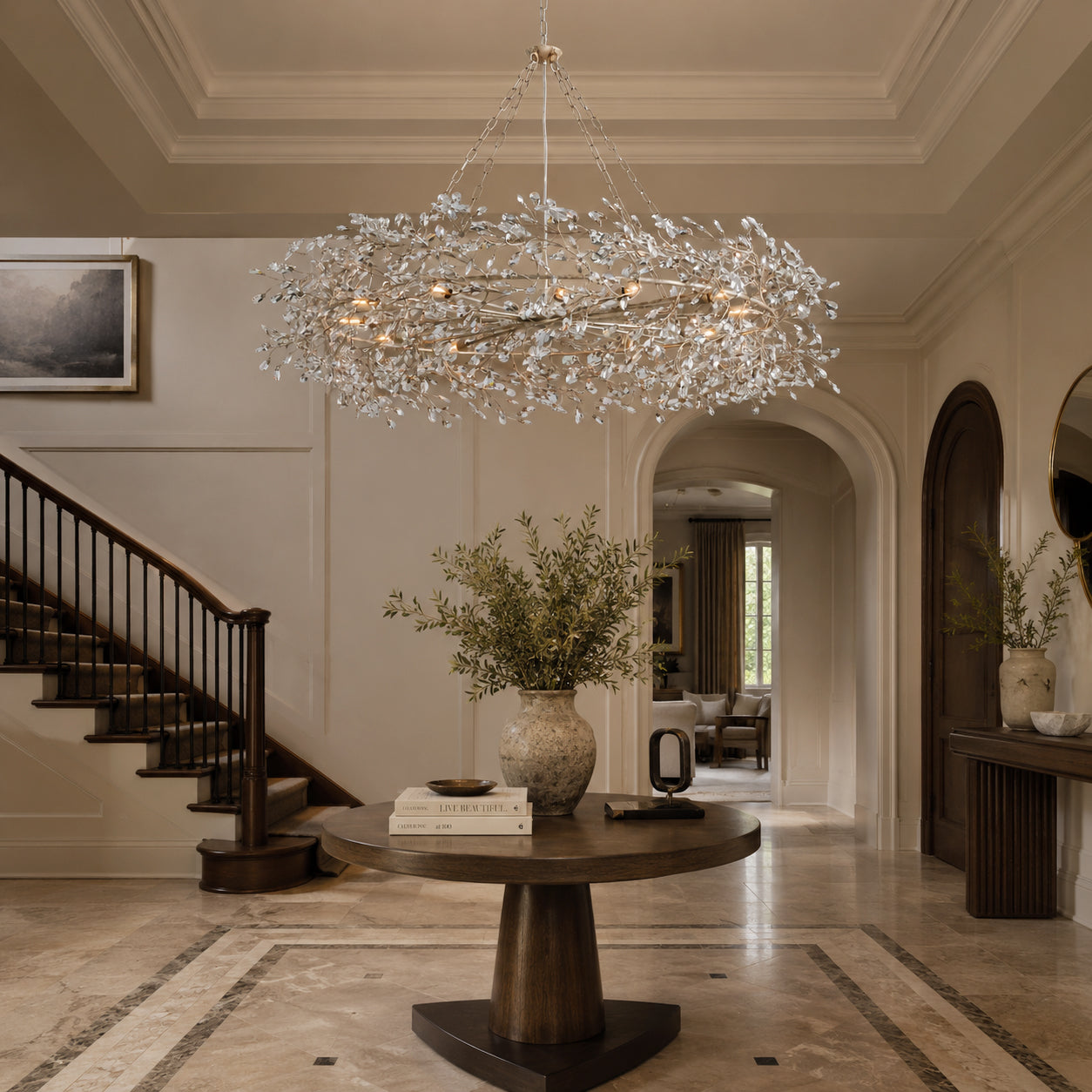
The chandelier may define the silhouette of a dining room, but color temperature determines how that room actually feels. The right light can soften marble, enrich walnut, flatter food, and make a gathering feel naturally intimate. The wrong light can make even a beautiful fixture feel cold, flat, or disconnected from the space around it.
The quick answer For most residential dining rooms, choose a dimmable chandelier with a color temperature between 2700K and 3000K. We generally prefer 3000K because it preserves warmth while giving crystal, brass, marble, and food a little more clarity. Use 2700K for a softer, candlelit atmosphere, and avoid 4000K or higher unless the dining area is unusually modern, commercial, or task-focused.
What Is Color Temperature?
Color temperature describes whether a light appears warm, neutral, or cool. It is measured in Kelvin, usually written as “K.” A lower Kelvin number produces warmer, more amber light. A higher Kelvin number produces whiter or bluer light.
Color temperature is not the same as brightness. Brightness is measured in lumens. Two bulbs can produce exactly the same number of lumens while creating completely different moods because one is 2700K and the other is 4000K.
| Color Temperature | Visual Character | Typical Feeling | Dining Room Suitability |
|---|---|---|---|
| 2200K–2400K | Very amber, similar to candlelight | Intimate, dramatic, atmospheric | Best as accent lighting, not usually the only light source |
| 2700K | Warm white | Relaxed, traditional, welcoming | Excellent for classic, organic, and residential dining rooms |
| 3000K | Warm white with clearer definition | Balanced, refined, versatile | Our preferred all-around option |
| 3500K | Soft neutral white | Fresh, contemporary, more functional | Suitable for some modern or multipurpose spaces |
| 4000K | Neutral-to-cool white | Crisp, bright, commercial | Usually too cool for a residential dining room |
| 5000K+ | Daylight-like, blue-white | Clinical, task-oriented | Generally not recommended |
Why Color Temperature Matters More Than Most Homeowners Expect
Dining rooms are emotional spaces. They are used for family dinners, celebrations, quiet breakfasts, holiday gatherings, and long conversations. Unlike a utility room, the goal is not simply maximum visibility. The goal is visual comfort.
Color temperature influences that comfort in several ways. It affects how skin tones appear, how food looks on the table, how reflective materials sparkle, and whether natural finishes feel rich or washed out. A dining room can be beautifully furnished and still feel wrong if the lighting is too cold.
It changes the way food looks
Warm-to-neutral light generally makes food appear more appetizing because it supports natural reds, golds, browns, and greens. Very cool light can flatten those colors and make a dining setting feel more like a workplace than a place to gather.
It changes how people look
Warm white light is typically more flattering to skin tones. This matters in a dining room, where the chandelier often sits near eye level and illuminates faces directly.
It changes how materials read
Brass can look rich and golden at 2700K or 3000K, but pale and slightly green under cooler light. Walnut can appear deeper and more dimensional under warm light, while cool light may make it look gray. Crystal often benefits from 3000K because the light remains warm while producing clearer highlights.
Carra Home Designer’s Note
When evaluating a bulb, do not look at the light source alone. Look at what the light does to the table, chairs, wall color, floor, artwork, and chandelier finish. The correct color temperature is the one that makes the whole composition feel intentional.
2700K vs. 3000K: Which Is Better for a Dining Room?
This is the most important choice for most homeowners. Both 2700K and 3000K are excellent, but they create slightly different results.
| Consideration | 2700K | 3000K |
|---|---|---|
| Overall mood | Softer, warmer, more intimate | Warm but clearer and more balanced |
| Best for | Traditional, organic, rustic, romantic interiors | Transitional, modern luxury, contemporary interiors |
| Brass and bronze | Rich, amber, classic | Warm, polished, slightly more modern |
| Crystal | Softer sparkle | Sharper sparkle without feeling cold |
| White marble | Creamier and warmer | More accurate white with gentle warmth |
| Food presentation | Very inviting | Inviting with slightly better color clarity |
| Open-plan homes | May feel too warm next to a bright kitchen | Usually easier to coordinate |
| Our verdict | Best for mood | Best overall balance |
Choose 2700K when:
- You want the dining room to feel especially intimate and relaxed.
- Your interior uses warm wood, antique brass, bronze, linen, or earthy wall colors.
- The dining room is separate from a brighter kitchen or living area.
- You prefer a traditional or candlelit atmosphere.
Choose 3000K when:
- Your home is transitional, modern, or open-plan.
- Your chandelier combines glass, crystal, brass, nickel, or sculptural metal.
- You want warmth without making white walls or marble look yellow.
- The dining table is also used for homework, work, or everyday tasks.
Carra Home Recommendation
When the choice is uncertain, start with 3000K. It is warm enough for a welcoming dining atmosphere but clear enough to work with modern architecture, crystal, polished metal, marble, and open-plan spaces.
Recommended Color Temperature by Interior Style
| Interior Style | Recommended Range | Why It Works |
|---|---|---|
| Organic Modern | 2700K–3000K | Enhances wood, stone, linen, plaster, and softly textured surfaces. |
| Transitional | 3000K | Balances traditional warmth with contemporary clarity. |
| Modern Luxury | 3000K | Supports crystal, marble, brass, and refined finishes without feeling yellow. |
| Modern Minimalist | 3000K–3500K | Keeps the room clean and architectural while preserving residential comfort. |
| Traditional | 2700K | Complements dark wood, classic furniture, warm metals, and layered textiles. |
| French-Inspired | 2700K–3000K | Creates softness around crystal, antique brass, painted finishes, and elegant detailing. |
| European Contemporary | 3000K | Works well with sculptural lighting, natural stone, walnut, and restrained palettes. |
| Industrial | 3000K–3500K | Maintains clarity around black metal and concrete without becoming overly cold. |
How Different Materials React to Color Temperature
Brass
Best range: 2700K–3000K
Warm light enriches brass and creates a deeper golden tone. Around 3000K, brass still feels warm but appears cleaner and more contemporary.
Crystal
Best range: 3000K
Crystal needs enough clarity to sparkle. At 3000K, reflections remain elegant and lively without developing the icy quality often seen at 4000K or above.
Alabaster
Best range: 2700K–3000K
Warm light reveals veining and creates a soft internal glow. Cooler light can make alabaster appear flat or gray.
White Marble
Best range: 3000K
At 2700K, white marble may appear creamier. At 3000K, it retains more of its natural white while still feeling warm and residential.
Walnut
Best range: 2700K–3000K
Warm light emphasizes depth, grain, and natural red-brown undertones. Cooler light can make walnut look muted.
White Oak
Best range: 3000K
White oak benefits from a balanced warmth that preserves its pale, natural appearance without turning it overly yellow.
Linen Shades
Best range: 2700K–3000K
Linen diffuses light beautifully. Warm white enhances its softness and creates an especially comfortable dining environment.
Chrome and Polished Nickel
Best range: 3000K–3500K
These cooler metals can handle slightly higher color temperatures, although 3000K is still the safer choice for a residential dining room.
Why CRI May Matter More Than Kelvin
Color temperature tells you whether the light looks warm or cool. CRI, or Color Rendering Index, tells you how accurately colors appear under that light.
A low-CRI 3000K bulb can still make food, wood, textiles, and skin tones look dull. A high-CRI 3000K bulb makes the same room appear richer and more natural. For dining rooms, we recommend a CRI of at least 90. A CRI of 95 or higher is ideal when the room features artwork, natural stone, colorful tableware, or premium finishes.
What should you look for on the bulb specification? Color temperature: 2700K or 3000K
CRI: 90+
Dimming: compatible with your fixture and wall dimmer
Brightness: appropriate lumens for the room and fixture
CRI: 90+
Dimming: compatible with your fixture and wall dimmer
Brightness: appropriate lumens for the room and fixture
It is also helpful to consider consistency. If a chandelier uses multiple bulbs, use the same brand, model, color temperature, and CRI in every socket. Mixing slightly different bulbs can produce uneven light and visible color differences.
Should Dining Room Chandeliers Be Dimmable?
In most cases, yes. A dimmer is one of the most effective upgrades for a dining room because the ideal brightness changes throughout the day.
| Situation | Recommended Light Level | Desired Effect |
|---|---|---|
| Breakfast or daytime use | 70%–100% | Clear, fresh, functional |
| Everyday family dinner | 50%–75% | Comfortable and welcoming |
| Entertaining guests | 35%–60% | Refined and relaxed |
| Formal dinner | 25%–50% | Intimate and atmospheric |
| Homework or working at the table | 80%–100% | Better task visibility |
Confirm that the chandelier, bulb, LED driver, and wall dimmer are all compatible. Dimmer incompatibility can cause flickering, buzzing, limited dimming range, or bulbs that do not turn off completely.
How to Layer Lighting in a Dining Room
The chandelier should not always carry the entire room. Layered lighting creates greater comfort and flexibility.
1. Decorative lighting
The chandelier establishes the visual center of the dining room and provides the primary atmosphere above the table.
2. Ambient lighting
Recessed lights, ceiling lights, or indirect cove lighting can support general visibility. These lights should usually match or closely coordinate with the chandelier’s color temperature.
3. Accent lighting
Wall sconces, picture lights, or concealed cabinet lighting can add depth and highlight artwork or architectural details.
4. Candlelight
Real or battery-operated candles introduce a much warmer layer, often around 1800K–2200K. This is perfectly acceptable as an accent even when the chandelier is 2700K or 3000K.
A Note on Mixing Color Temperatures
Avoid placing 2700K and 4000K light sources side by side in the same dining room. The difference will be visually obvious. Mixing 2700K and 3000K can work when the warmer light is clearly used as an accent, but the main architectural lighting should remain consistent.
Common Dining Room Lighting Mistakes
Choosing 4000K because it “looks brighter”
Brightness should be solved with lumens, not a colder color temperature. A 3000K bulb can be just as bright while feeling far more comfortable.
Ignoring CRI
Kelvin alone does not guarantee attractive light. Low-CRI bulbs can make food, textiles, finishes, and skin tones look lifeless.
Using different bulbs in one chandelier
Even bulbs labeled 3000K can vary between brands. Use identical bulbs throughout the fixture.
Not testing the light at night
Daylight can hide problems. Evaluate the chandelier after sunset when it becomes the room’s primary light source.
Forgetting surrounding rooms
In open-plan homes, the dining room color temperature should coordinate with the kitchen and living room to avoid abrupt visual shifts.
Choosing a fixed output with no dimmer
A single brightness level rarely works equally well for family dinners, entertaining, work, and special occasions.
How to Test Color Temperature Before Committing
- Buy one high-CRI 2700K bulb and one high-CRI 3000K bulb with similar lumen output.
- Test each bulb in the actual dining room after sunset.
- Place your usual tableware, food, flowers, and textiles on the table.
- Observe the chandelier finish, wall color, floor, artwork, and nearby rooms.
- Take photos from the same position. Cameras often reveal color differences that are less obvious at first glance.
- Choose the temperature that makes the entire room feel balanced, not simply the bulb that looks brightest.
Practical Buying Checklist
- 2700K or 3000K for most residential dining rooms
- CRI 90 or higher
- Dimmable bulbs and compatible dimmer
- Consistent bulbs across the entire fixture
- Enough lumens for the room size and chandelier design
- Color temperature coordinated with nearby spaces
- Tested at night before finalizing
Frequently Asked Questions
Is 2700K too yellow for a dining room?
Usually not. In homes with warm wood, brass, cream walls, linen, or traditional furniture, 2700K often feels natural and inviting. It may look overly yellow only in very white, gray, or strongly contemporary interiors.
Is 3000K too white for dining?
No. High-quality 3000K lighting still reads as warm white. It is one of the most versatile choices because it provides warmth while keeping marble, crystal, white walls, and food visually clear.
What is the best color temperature for a crystal chandelier?
We generally recommend 3000K with a CRI of 90 or higher. It produces a cleaner sparkle than 2700K while avoiding the icy effect of 4000K or cooler light.
What is the best color temperature for a brass chandelier?
Both 2700K and 3000K work well. Choose 2700K for a richer, more traditional golden effect. Choose 3000K for a cleaner, more contemporary brass appearance.
Can I mix 2700K and 3000K in the same room?
Yes, but use them deliberately. For example, a 3000K chandelier can work with 2700K candles or decorative accent lighting. Avoid randomly mixing bulb temperatures in the same chandelier or across adjacent ceiling lights.
Should the dining room and kitchen use the same color temperature?
In an open-plan layout, using the same color temperature usually creates the most cohesive result. If the rooms are visually separated, a dining room can be slightly warmer than the kitchen.
Is 4000K ever appropriate in a dining room?
It can work in a highly modern, commercial-inspired, or strongly task-oriented space, but it is rarely the best choice for a residential dining room. Most homeowners find 3000K more comfortable.
How bright should a dining room chandelier be?
Brightness depends on room size, chandelier design, shade material, and whether other lights are present. Rather than relying on a single lumen rule, choose sufficient output and install a dimmer so the room can adapt to different uses.
Does LED lighting change color when dimmed?
Most standard LED bulbs keep the same color temperature as they dim. “Warm dim” or “dim-to-warm” LEDs become warmer at lower brightness levels, more closely imitating incandescent and candlelight.
Carra Home’s Final Recommendation
For a dining room that feels refined, comfortable, and adaptable, we generally recommend a dimmable chandelier paired with 3000K lighting and a CRI of at least 90.
This combination works particularly well with crystal, brass, marble, walnut, linen, glass, and most transitional or contemporary interiors. Choose 2700K when you want a softer, more traditional atmosphere. Reserve 3500K for especially modern or multipurpose rooms, and avoid 4000K or higher unless the design intentionally calls for a cooler, more commercial feeling.
The best dining room light should not call attention to its technical specifications. It should simply make the room, the food, the materials, and the people around the table look and feel their best.
Choose Lighting That Feels Right at Home
Explore Carra Home’s thoughtfully selected dining room chandeliers and choose a fixture that complements both your interior and your lighting plan.
Replace this sentence with a Shopify collection link or product recommendation before publishing.