



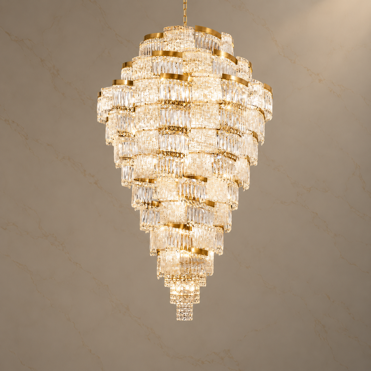
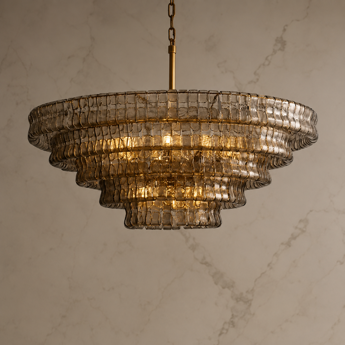
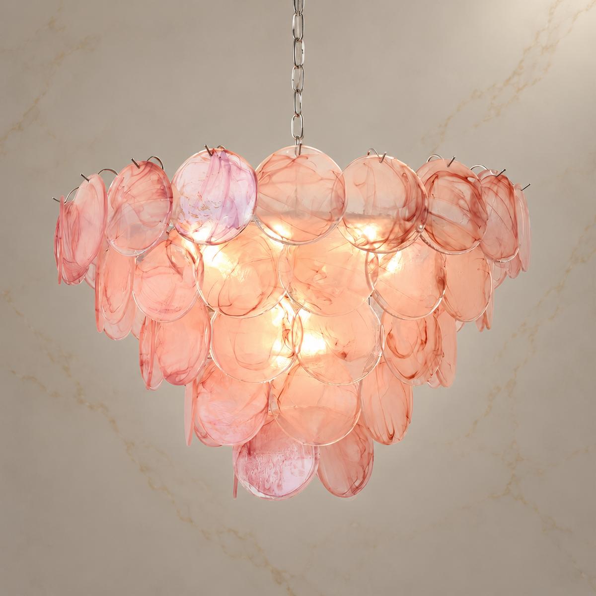
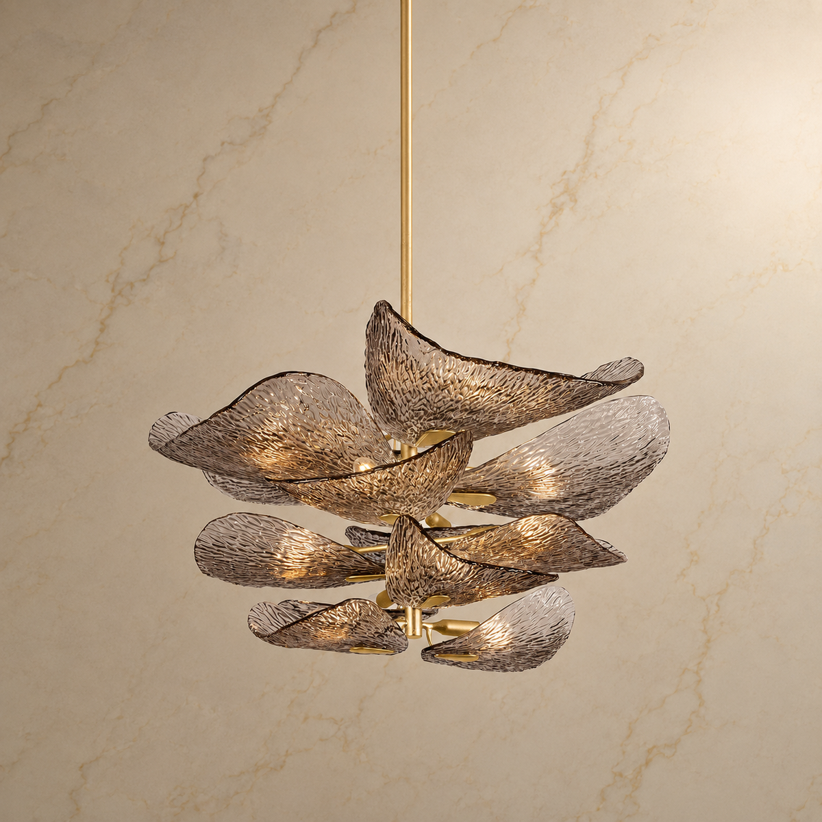
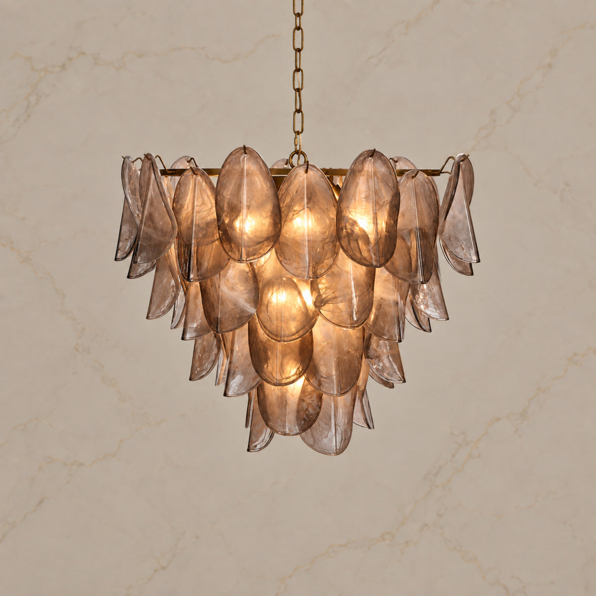
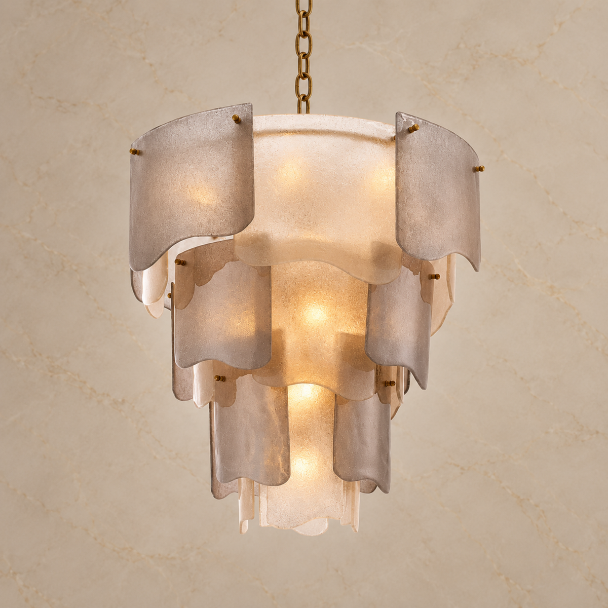


Alabaster Veining and Color Variation: What to Expect
Carra Home Material Guide
A quiet vein. A warmer shade. A surface that changes with the light. Natural alabaster brings its own character to a room.
The quick answer
Natural alabaster varies in tone, veining, and translucency, giving every chandelier its own quiet character. Compare the overall warmth, pattern, and appearance in both lit and unlit views rather than expecting an exact match to a single photograph.

Part of alabaster’s appeal is that the surface holds your attention without demanding it. From across the room, you may notice a simple pale silhouette. Closer up, a faint line or a clouded area gives the stone more depth.
Choosing it is easier when you know which details to compare. Rather than looking for a duplicate of a single photograph, look for a balance of tone, pattern, and form that you would enjoy in your own home.
Why does alabaster vary?
Natural stone does not have the repeatable appearance of a printed finish. The piece selected and the way it is cut determine which part of its pattern appears on the shade. Within one fixture, neighboring stone elements may therefore have different markings.
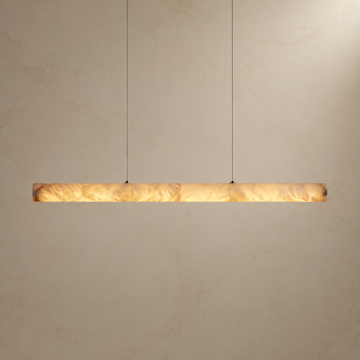
Carra’s Halima and Aveline listings explicitly describe variation in color, veining, and translucency. That is useful purchase information: a consistent design does not mean an identical stone pattern on every chandelier.
The name “alabaster” also has more than one historical use. The Oxford University Museum of Natural History’s material guide distinguishes gypsum alabaster from calcite stones that have also carried the name. A product image alone cannot establish mineral composition or quarry origin. For the broader material introduction, see our alabaster chandelier buyer’s guide.

How to look at tone, veining, and translucency
Separate these three qualities as you browse. They describe different aspects of the appearance and help you explain what you like without asking for a pattern that natural stone may not repeat.
Overall tone: the impression from across the room
Start with the broad impression: does the stone appear pale and quiet, creamy and warm, or more strongly contrasted? Then consider it beside your walls, upholstery, and timber. A close match to a photograph is less useful than understanding whether the overall palette will work with those surfaces.
Do not judge the stone’s underlying color from an illuminated image alone. Warm lighting can make a pale surface look more golden. Daylight, reflected colors, and the camera’s processing also influence what reaches your screen.

Veining: the pattern within the surface
Look at the strength, spacing, and direction of the visible markings. A few fine lines can feel very different from a broad, clouded area, even when both pieces belong to the same pale palette. “Subtle veining” and “more visible movement” are useful descriptions of preference, not universal stone grades.
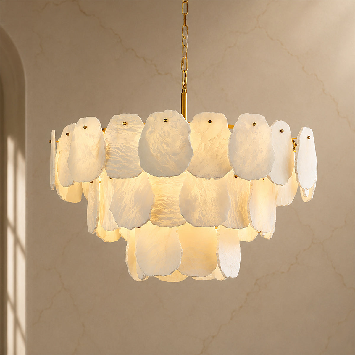
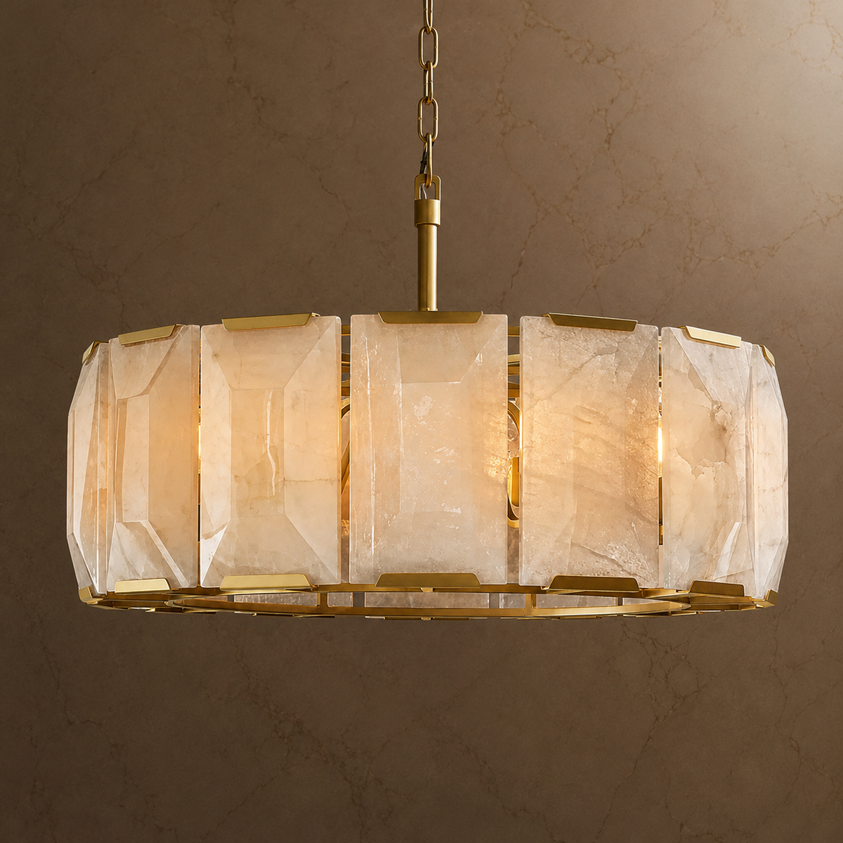
With a panel design such as Lunareth, consider the rhythm across the whole shade. Individual panels need not mirror one another for the fixture to feel balanced. If closely matched panels matter to you, ask what degree of matching can actually be supplied before ordering.
Translucency: how the stone reads when illuminated
A backlit shade may show areas of different apparent brightness. Stone characteristics, thickness, and the position of the light source can all contribute to the appearance. A brighter patch in a catalog image is not, on its own, evidence that the stone is thinner, better, or worse.

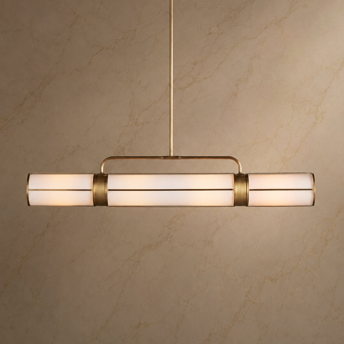
Halima’s long stone form gives the eye a continuous surface to follow. When considering a linear design, look along the full length as well as at its most attractive close-up. The overall distribution of pattern is what will sit above your table or island.
Why does alabaster look different with the light on?
With the fixture off, you mainly see the stone in the room’s ambient light. With it on, light passing through the shade becomes part of the picture. Areas that looked quiet in daylight may become more noticeable; other details may soften in the glow.


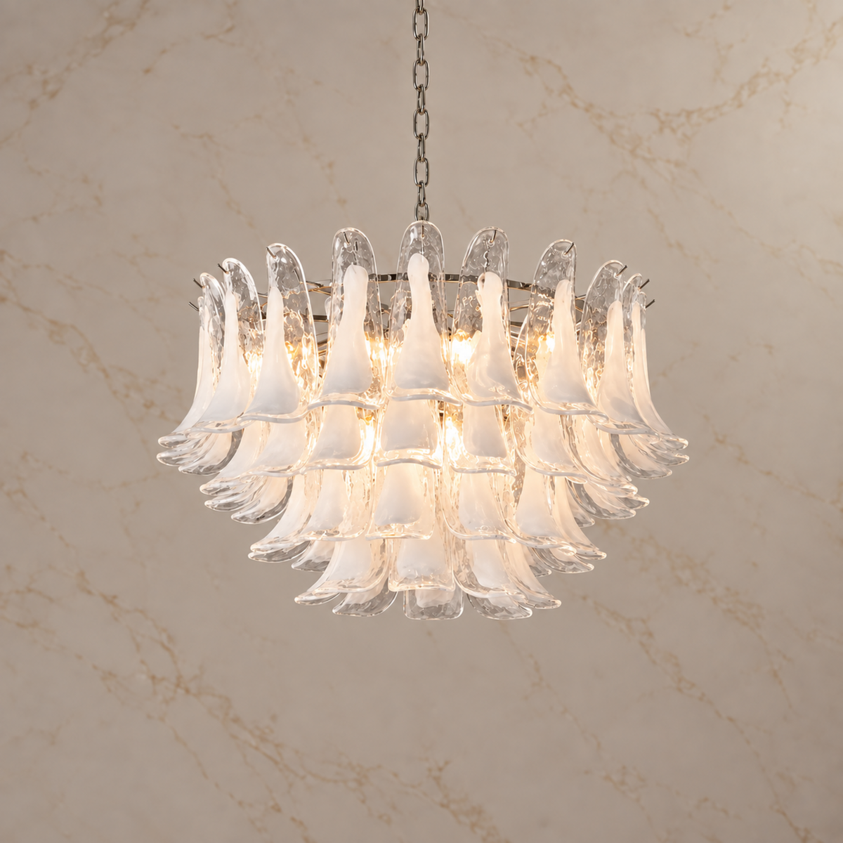
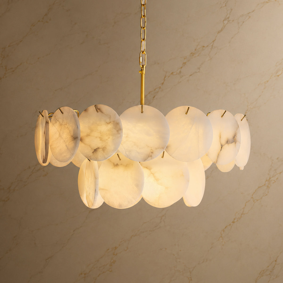
Carra catalog views. A styling comparison, not a controlled same-stone test.
The two Halima catalog views illustrate the lit and unlit presentation of the design. They are not a controlled test or verification of the exact stone you will receive. Use them to consider the two moods, then ask for additional product information if a particular tone or marking is important to your decision.
For a useful comparison at home, keep the viewing position and room lighting similar. If the fixture uses replaceable bulbs, compare it with the same bulb type and color temperature. For integrated LEDs, check the specified light color and controls for the exact model. The stone does not determine the LED’s color temperature or dimming compatibility.
Our dining room color temperature guide explains how the light source contributes to the evening atmosphere.
What can product photographs tell you?
Photographs are useful for understanding a design’s silhouette and the kinds of surface detail shown. They cannot promise an exact match between your screen and a future piece of natural stone.
| What you notice | What to compare next | What to ask |
|---|---|---|
| The stone looks warmer in one image | Lit versus unlit views and the surrounding room colors | What light source and color temperature are shown? |
| One area has stronger pattern | The full shade, then a close-up of that area | What range of veining is typical for this design? |
| Adjacent panels look different | The overall arrangement rather than one isolated panel | How are the stone elements selected or matched? |
| A line looks concerning | Clear photographs from more than one angle | Can the seller review this specific mark? |
Ask whether any additional images show a representative example or the actual item allocated to your order. Those are different kinds of reassurance. Availability of individual-item photography or stone selection should be confirmed rather than assumed.
Choosing the character you prefer
A useful way to begin is to choose the amount of visual movement you want. For a room with expressive wood grain or strongly veined surfaces, you may prefer a quieter-looking shade. In a restrained room, more visible stone pattern can supply a point of interest.

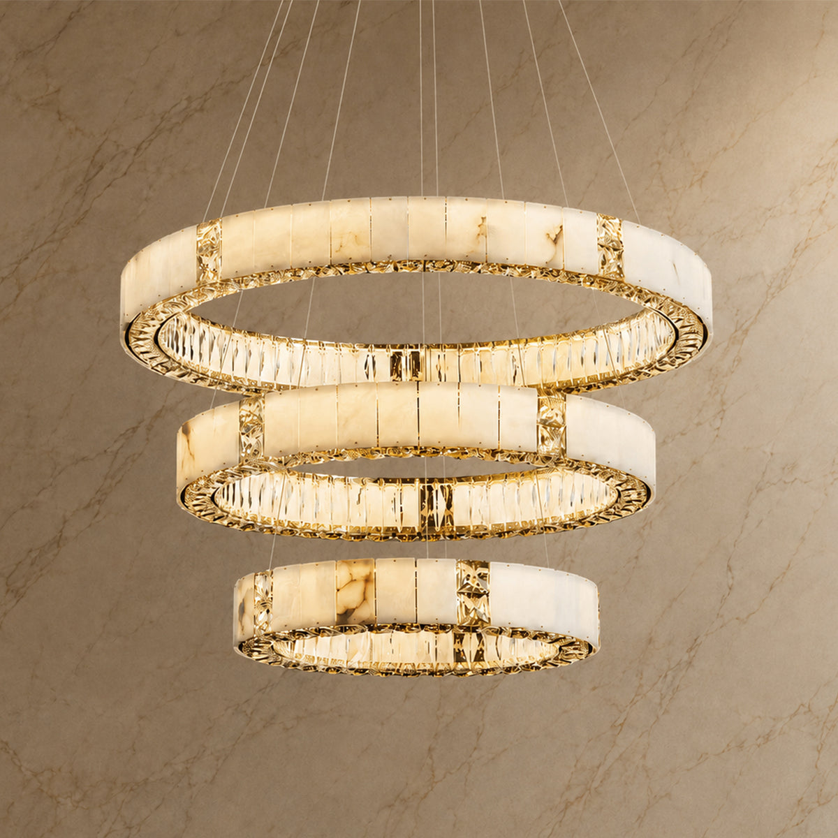
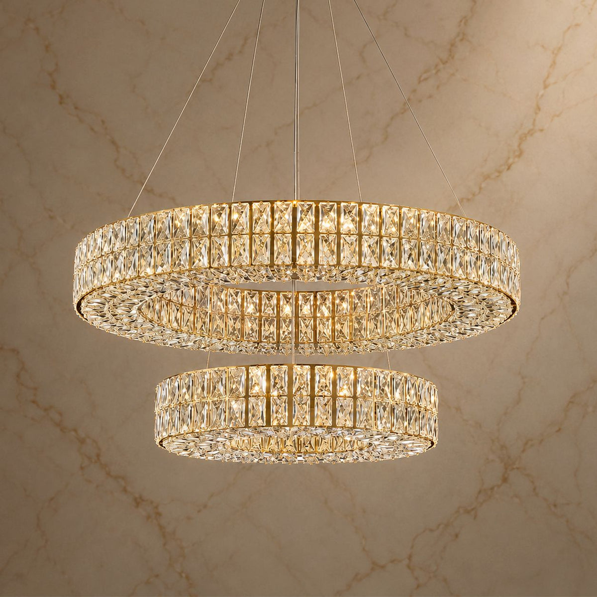
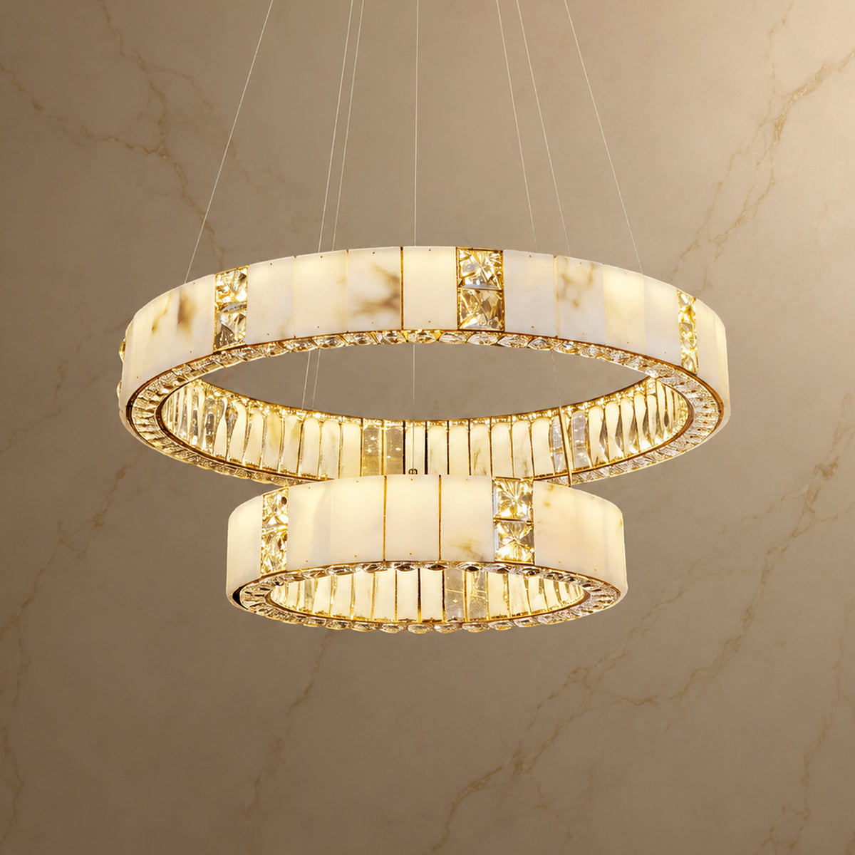
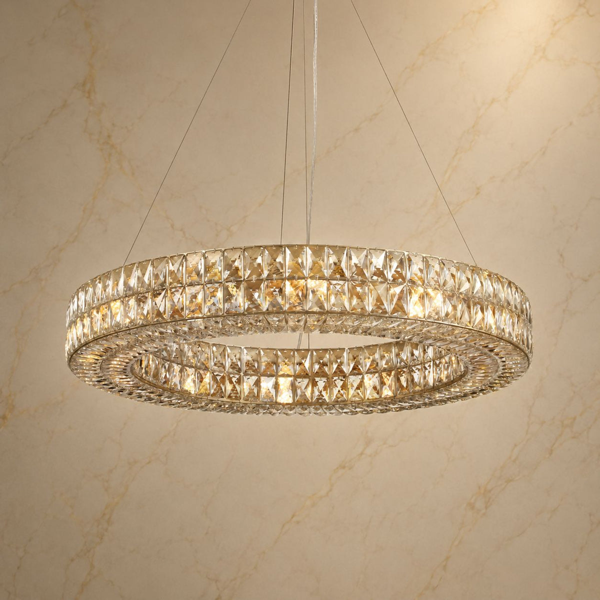
Aveline’s simple ring provides a clear outline around the stone. Arica uses separate rounded shades, while Lunareth presents a sequence of broad panels. These forms change how the material is read; none guarantees a particular strength of veining.
If you are choosing several fixtures for one room, think in terms of a coordinated family rather than exact twins. Share the quantity, the designs, and how close together they will be seen. Ask whether a similar overall tone can be accommodated and what variation remains likely.
A useful message to send before ordering
“I’m considering [product and size] for [room]. I prefer a pale overall tone with subtle veining rather than strong contrast. Could you share representative lit and unlit images, and let me know whether this preference can be accommodated? I understand that natural stone patterns vary.”
When the broader material choice is still open, our alabaster, glass, and crystal comparison can help. If the question is how a chosen silhouette will sit in your room, use Carra’s Design Preview Service. A room preview helps with composition; it does not predict the exact veining of your delivered stone.
When should you ask Carra for a closer look?
Variation in tone and pattern is expected in natural alabaster. That does not mean every mark should be accepted without review. A visible chip, an open separation, a loose element, or a change that appears after delivery deserves a specific assessment.
If you are uncertain, photograph the fixture before installation. Include an overall view, a clear close-up, and another angle that shows the surface. Add your order number and indicate where the mark appears. If the packaging was damaged, photograph that too.
Contact Carra through the contact page before attempting a repair or proceeding with a visibly damaged component. Do not scrape, press, or apply a cleaning product to a questionable line to test it. A photograph can guide the next step, but it may not be enough to identify the cause.
For a color concern, describe when you notice it: with the fixture off in daylight, only when illuminated, or under a particular bulb. That information is more useful than a filtered photograph or a screenshot with altered brightness.
Frequently asked questions
Will my alabaster chandelier look exactly like the product image?
The design should correspond to the model and variant you order, but natural stone markings and tone can vary. Ask about representative variation before buying if a particular appearance is essential to your room.
Does darker veining mean lower-quality alabaster?
Vein color alone does not establish quality. Consider the stated material, construction, finish, and condition. A stronger pattern may suit your preference or not; that is a separate question from whether a component is sound.
Is every line in alabaster a crack?
No. Natural markings can appear as lines, but a line cannot safely be classified from its color alone. Ask for review if you see an open gap, chipped edge, movement, or an unexplained change.
Why does the stone look yellow when the light is on?
The light source and surrounding colors can make the illuminated stone appear warmer. Compare an unlit view in neutral daylight and confirm the light source. A new discoloration that remains with the fixture off should be raised with the seller rather than assumed to be normal.
Can I request subtle veining or matching fixtures?
You can communicate that preference before ordering. Ask whether selection or matching is available for the specific design; do not assume an exact pattern or shade can be guaranteed.
Natural variation is part of the beauty.
Choose the silhouette first, then consider the warmth and movement you would like the stone to bring into your room.
About this guide. Product descriptions checked September 19, 2026. Linked Carra catalog images show design examples, not an inventory sample atlas or a guarantee of the stone supplied. The labeled AI room scene illustrates styling. Contact Carra for assessment of a specific item.